The word infographic is a combination of the words information and graphics and refers to any image that is intended to present knowledge, data or other information in a visual manner.
Infographics are a powerful visual tool that allow educators to convey information in a concise, engaging and visually appealing way. They combine text, graphics, and data to tell a story, aiming to make complex information easier to understand and remember. They are widely used in education to present information to students, explain concepts, and communicate ideas.
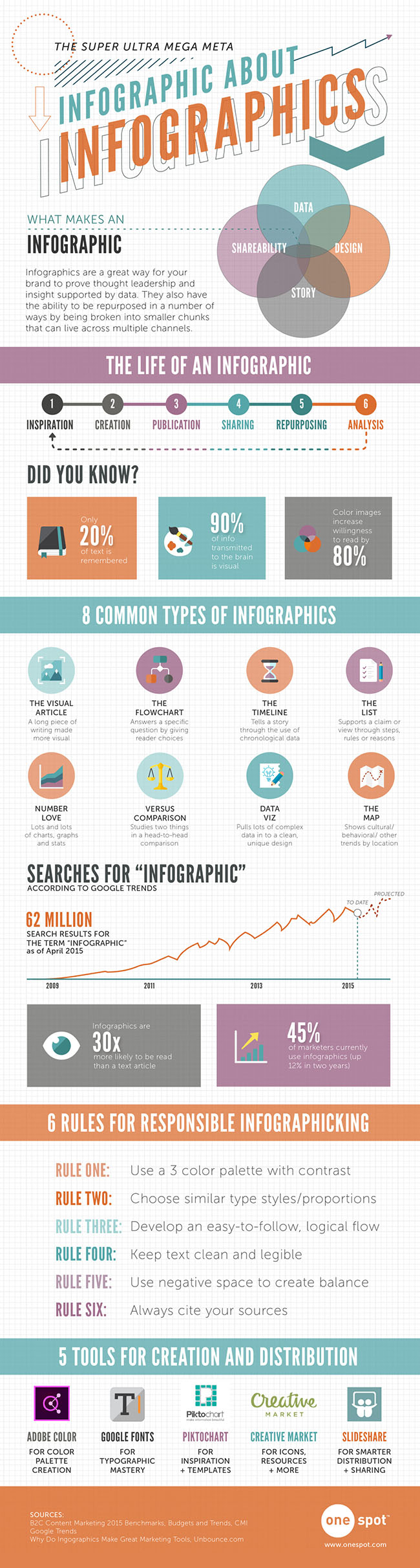
Infographics can be any size or shape. The long, thin image down the right-hand side of this page, for example, is a meta-infographic about infographics: click the image to see the full-sized original.
The infographic below is much simpler, smaller example from a collection on an Australian Government website. It is, essentially, a pie chart presented with supporting detail:

Mineral Exports by AGGA, CC BY 4.0
With the right tools and a little practice, anyone can create a compelling infographic that will capture the attention of students and other learners, and make the experience of engaging with data and other information more engaging.
To start creating infographics, you need something that you'd like to create an infographic for! This may start with something that you want to share with others: a process, a concept, or a set of data that you want to present in a clear and concise manner, for example. Think about what you want to achieve with your infographic and who your audience is. This will help you determine what information to include and how to present it.
To get started you will need access to software with graphic design facilities. This might sound daunting, but some applications you may already be familiar with, such as PowerPoint or Google Drawings, are also popular tools used to create simple infographics. There are more powerful graphic design software applications available, which have a steeper learning curve but offer much greater flexibility; and there are dedicated online tools such as Canva, Piktochart, and Adobe Spark which allow you to create your own visualisations from scratch or use templates to create professional-looking infographics quickly. These are just some examples and, as always, it is worth trying a few to see which ones work best for you.
When creating your infographic, it's important to remember that less is often more. Keep your design simple, with a clear visual route or hierarchy that guides the reader's eye from one point to the next. Use contrasting colours and fonts to make your infographic easy to read and visually appealing. It's also important to use high-quality images and graphics that are relevant to the content you are presenting, but don't forget to consider copyright when sourcing images and graphics (remember that resources shared with Creative Commons licencing can help to make this part of the process much easier).
In addition to the design elements of your infographic, it's important to pay attention to the text you include. Keep your text short and to the point, using bullet points and subheadings to break up longer blocks of text. Use a font size that is easy to read, and make sure your text is legible against the background colour or image you have chosen.
Another important factor to consider when creating an infographic is data visualization. Infographics are often used to present complex data sets in a way that is easy to understand. Use charts, graphs, and other visual aids to help your readers make sense of the data you are presenting, but make sure they're the right ones for the job: It's important to choose an appropriate type of visualization for your data, whether it's a traditional bar graph, pie chart, or something more creative.
When you have completed your infographic, make sure to test it out with a sample audience before releasing it into the wild. This will help you determine if your infographic effectively communicates the information you intended and if it is visually appealing and easy to read. You can also use feedback from your audience to improve your design and ensure that it meets the needs of your intended audience.
Next steps:
- See some more examples of infographics in Canva's post collecting together 40 of the best infographics, and let Piktochart teach you how to make an infographic in 30 minutes.
- Scroll through your social media newsfeeds and see if you can spot any infographics being shared by the people and organisations that you follow. Or, if you watch the news, do they present anything on screen that might qualify as an infographic?
Make some notes about what you think is 'good' and 'bad' about examples that you find. Are they easy to understand, or are they cluttered and confusing? Do the visualisations that they have chosen to include add to the story they're trying to tell, or do they distract from it?
Further reading:
- In the Glossary: Canva | Creative Commons |
- Elsewhere online: Mathematics Teaching in Indonesia: An Infographic | Infographics (Wikipedia) |
Comments
Post a Comment